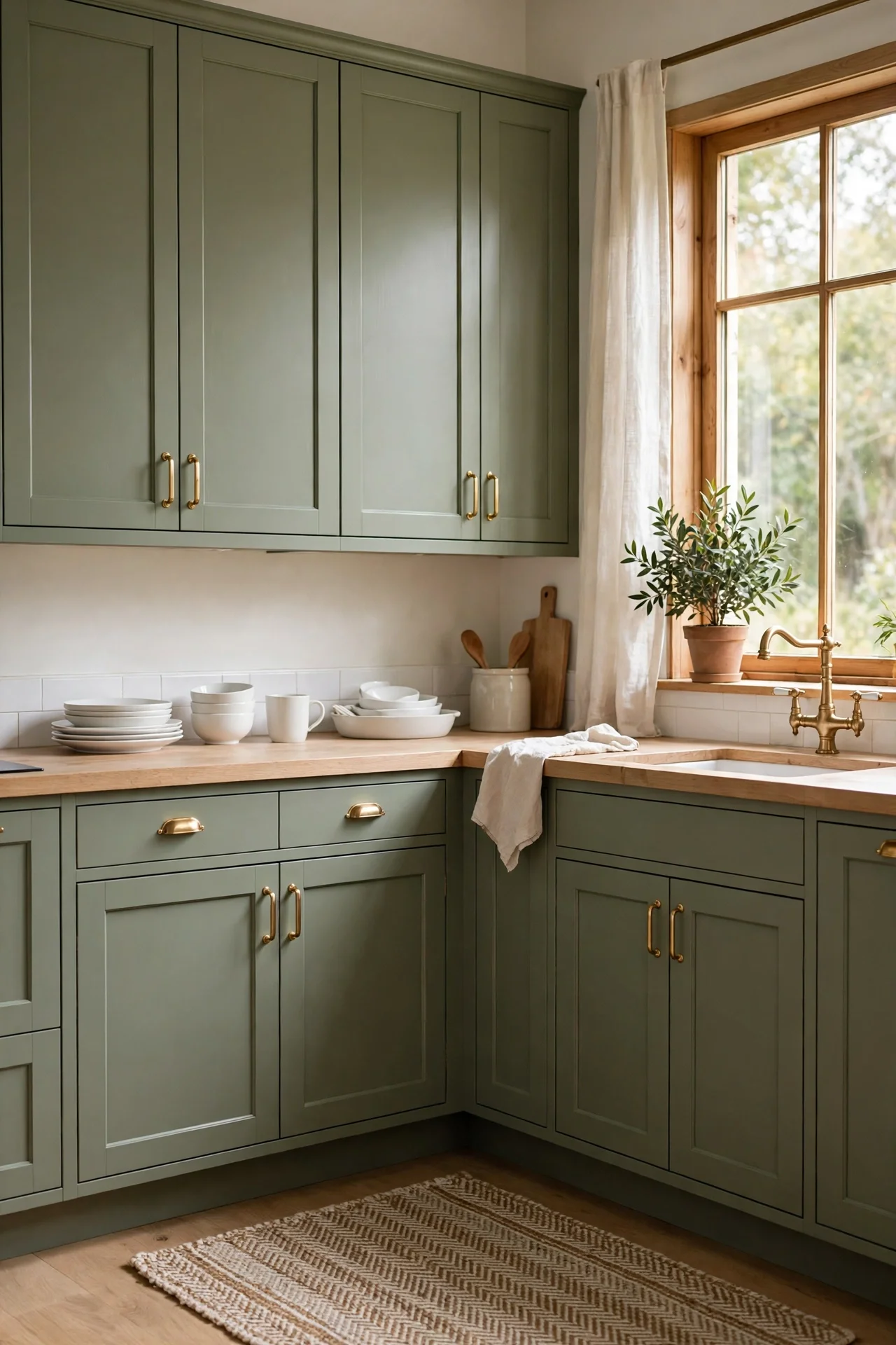
Kitchen Cabinet Color Ideas That Refresh the Whole Room
Cabinet doors cover more wall space than any other surface in most kitchens, so their color quietly sets the mood of the whole room. When cabinets look tired, the entire kitchen feels dated, even when the counters, floor, and appliances are sound.
Paint offers the cheapest route to a fresh looking kitchen because cabinets take color well and need no building work. One careful weekend with a brush can change how the room feels at breakfast, at dinner, and under evening light.
Inside this guide, you will find fifteen colors and color pairings that suit real kitchens, from tiny galley layouts to wide family rooms. Each idea explains why the color works, how to use it well, who it suits best, one real example, and one mistake worth avoiding.
What Are the Best Kitchen Cabinet Color Ideas for a Fresh Look?
Light colors that bounce daylight around and deeper colors that ground the room both earn their place. Strong kitchen cabinet color ideas match the color to the light the room actually gets, the tones already on the floor and counters, and the mood you want when you cook.
Picture two kitchens with the same cabinets painted in contrasting colors. Soft sage in one calms the morning rush and hides everyday marks, while deep navy in the other turns plain white counters into a feature. Color does the heavy lifting in both rooms before a single accessory arrives.
Classic White That Brightens Small Kitchens
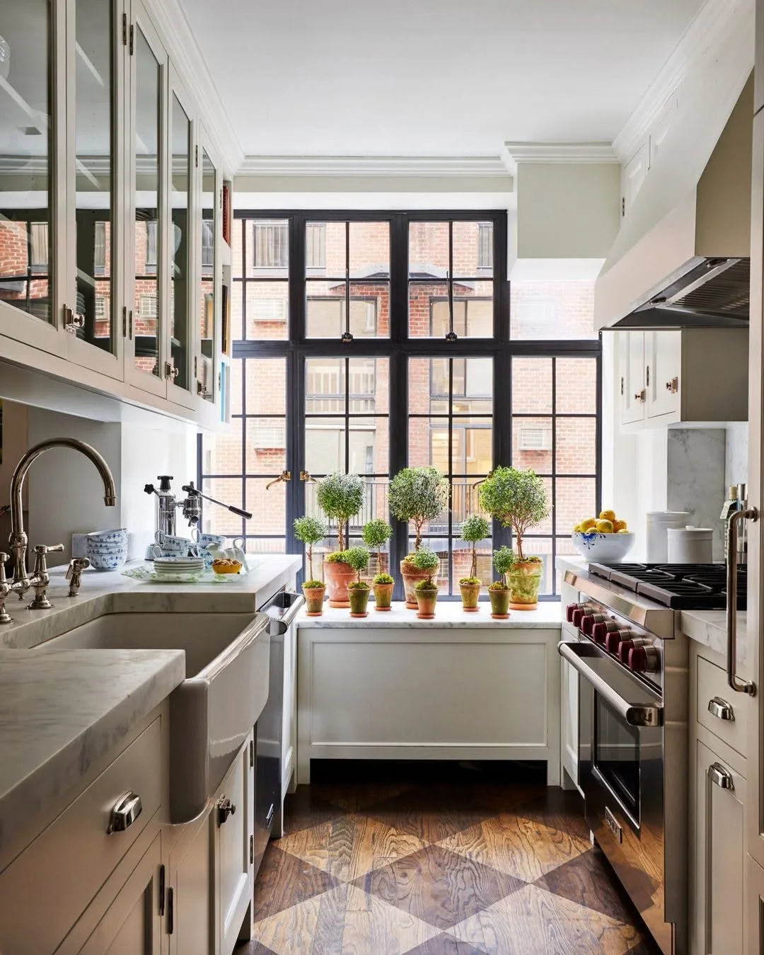
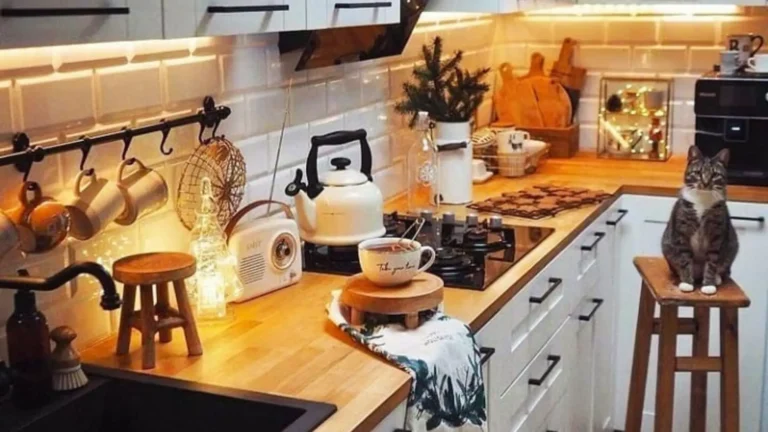
White cabinets bounce light into every corner, which is why they suit small kitchens with one window or none at all. Clean white also pairs with almost any counter, floor, and handle finish, so the room stays flexible when other pieces change over the years. White also gives the room one calm background, so patterned tiles, wood shelves, and colorful stools can come and go without clashing.
Choose a white with a hint of warmth if your kitchen faces north, because stark blue whites can feel cold under grey daylight. Keep walls a shade softer than the cabinets so doors stand out gently, and pick satin or eggshell paint that wipes clean after cooking splashes. Sample boards help here, because two whites that look identical in the shop can split into warm and cold once they stand side by side at home.
Busy family kitchens and homes preparing for a sale suit white cabinets best, because the look feels fresh to nearly everyone. Compact layouts gain most, since white pushes visual boundaries outward and makes narrow galley kitchens feel wider than they measure. White also photographs honestly, which matters when a home goes on the market and buyers scroll through bright kitchen pictures first.
One couple painted dated orange toned cabinets in warm white and kept their old black handles. Guests assumed they had bought a brand new kitchen, and the whole project cost less than a single replacement cabinet would have. They sanded on Saturday, primed in the evening, and rolled two coats on Sunday, eating takeaway among the dust sheets.
Glossy pure white shows every fingerprint, splash, and crumb, and it can look harsh under bright ceiling lights. Flat finishes mark just as fast and clean poorly. Mid sheen warm white hides daily life best while keeping the bright effect people want. Wiping handles and kick boards weekly keeps white looking fresh rather than grey along the edges.
Warm Cream for a Softer Look
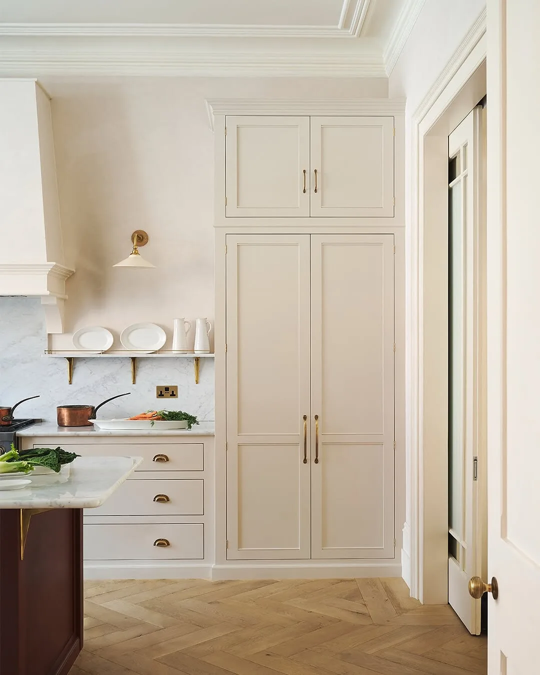
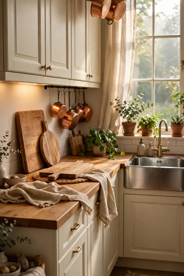
Cream softens the brightness of white while keeping the same light and airy feel. Gentle warmth suits kitchens that get strong sun, because cream never glares at midday and still glows softly in the evening.
Pair cream cabinets with warm wood counters, brass handles, or terracotta tiles for a settled look. Keep the wall color one step lighter or deeper than the cabinets, since matching them exactly makes doors disappear and the room feel flat.
Households that find pure white too sharp usually settle happily on cream, because it flatters skin tones and food alike. Traditional homes and country style kitchens suit cream best, though cream also warms modern rooms with plain lines.
When one homeowner tested white and found it cold, she switched to cream with warm wood shelves. Mornings felt calmer at once, and the change cost nothing beyond a fresh tin of paint on the same weekend.
Yellow heavy creams can look dated and slightly dirty beside bright white appliances. Test your cream next to the fridge and under evening light before committing, and lean toward pale mixes that read as warm rather than beige.
Sage Green for a Calm Natural Feel
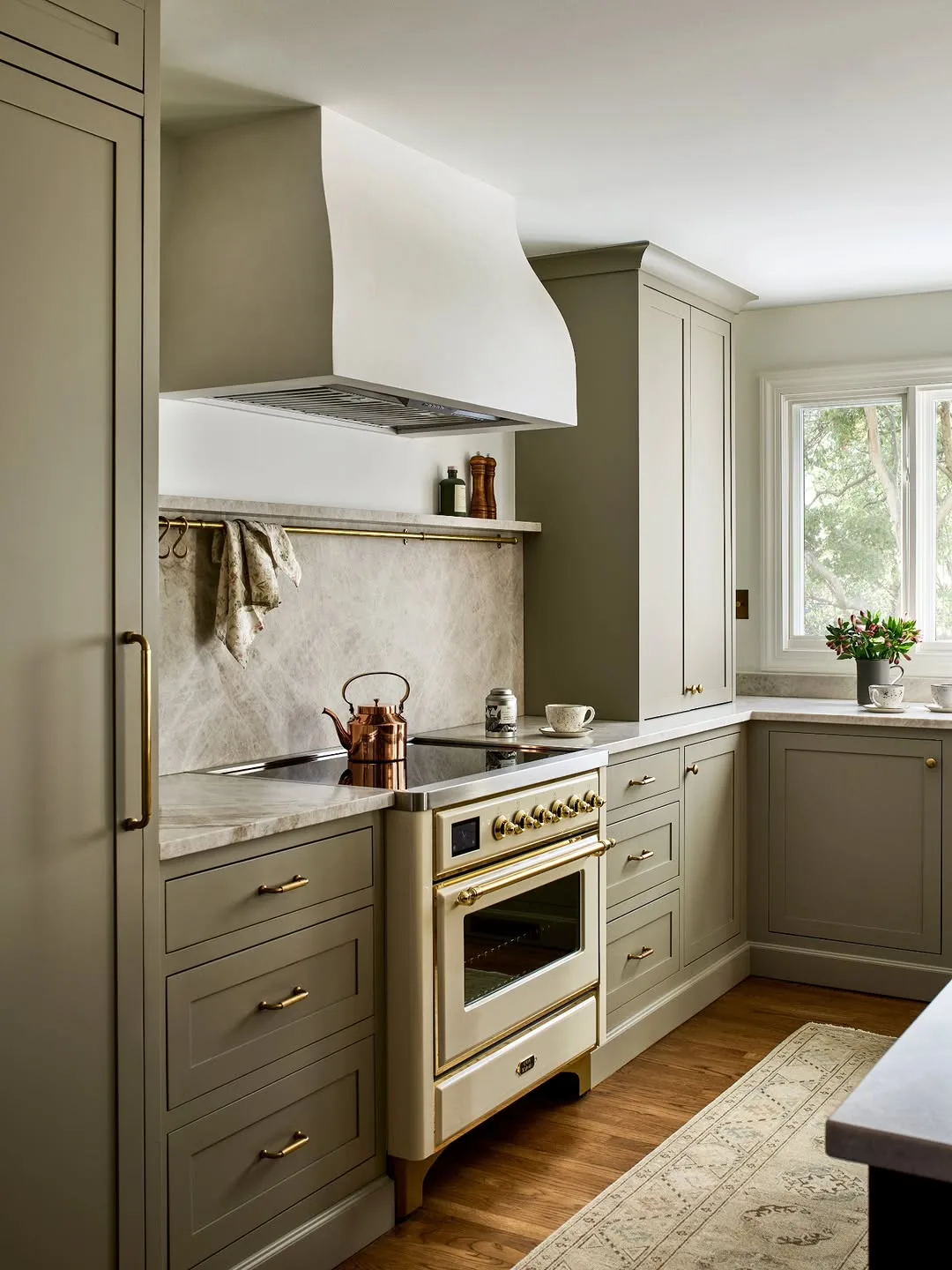
Sage green brings the calm of a garden into the kitchen without shouting for attention. Muted grey undertones keep the color grown up, and sage pairs easily with wood, white stone, and black or brass handles. Sage also sits comfortably beside stainless steel, so modern appliances never fight the color.
Among the most loved kitchen cabinet color ideas of recent years, sage stands out because it works in both bright and dim rooms. Paint lowers only if you want a gentle trial, or commit to every cabinet when the room needs a clear mood shift. Full sage schemes work best when counters stay pale and floors stay mid toned, giving the green room to breathe.
Garden facing kitchens and homes with lots of natural wood suit sage best. Cooks who spend long slow hours in the kitchen often pick sage because the color stays restful across a whole day of changing light. People who keep herbs, fruit bowls, and wooden boards on display find sage frames them all without effort.
One family painted their lower cabinets sage and left open shelves above in natural pine. Herbs on the sill echoed the green, and the kitchen suddenly matched the garden view it had framed all along. The change took two tins of paint and one weekend, and nobody missed the tired cream it replaced.
Bright or minty greens date quickly and fight with food colors on the counter. Sage needs its grey base to stay calm, so compare swatches in daylight and reject any mix that reads as pastel or neon. Hold swatches against any green plants you own, because clashing greens jar more than people expect.
Deep Navy That Grounds Pale Counters
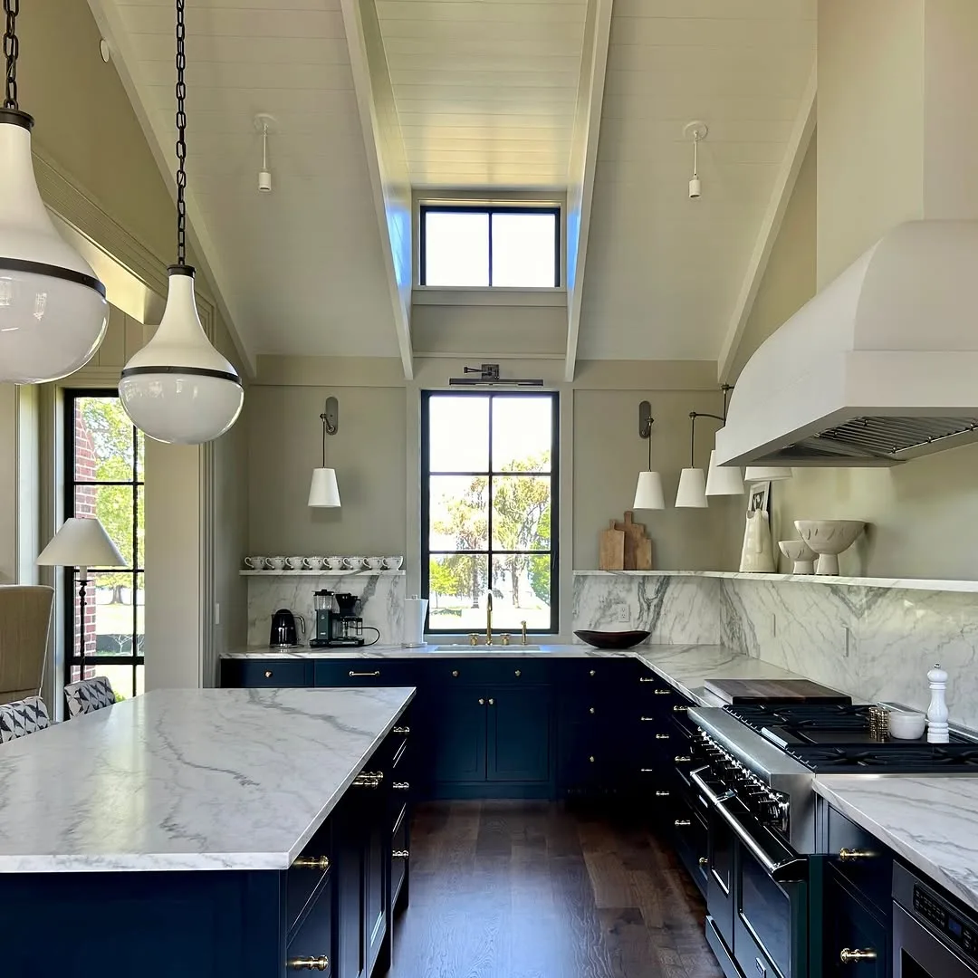
Deep navy gives pale counters and light floors a strong anchor, so the whole room feels planned rather than washed out. Navy reads as a neutral in practice, pairing with white, wood, brass, and steel without fuss.
Keep navy on lower cabinets or on one full wall of units when the room feels small, since dark color on every door can close in a dim kitchen. Strong light, whether from windows or good ceiling lamps, helps navy look rich instead of flat.
Kitchens with white stone counters, pale tiles, or marble effect surfaces suit navy best. Households that cook a lot also like navy because splashes and scuffs hide far better than they do on pale paint.
One homeowner painted only the island and lower cabinets navy, leaving the uppers white. Pale counters suddenly looked brighter, and the room gained the tailored feel of a much pricier kitchen for very little money.
Pairing navy with black counters and dark floors pushes a small kitchen toward cave territory. Something pale needs to balance the depth, whether counters, walls, floor, or a wide splashback in a light tone.
Soft Grey That Suits Modern Homes
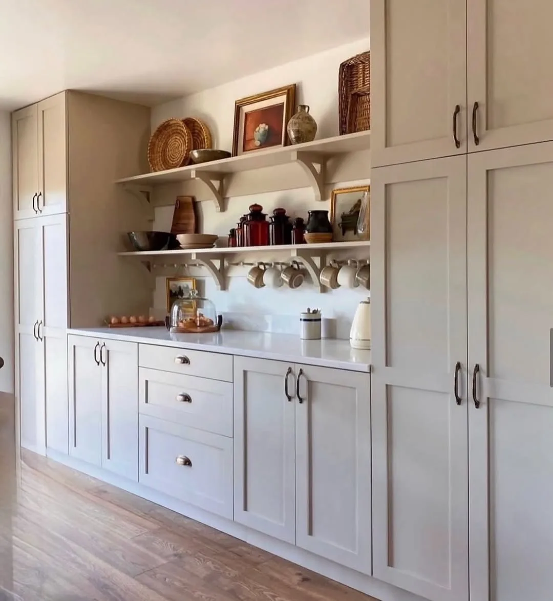
Soft grey suits modern kitchens because it sits quietly behind steel appliances, stone counters, and plain lines. Grey also hides the small marks of daily cooking better than white while keeping a calm, light mood. Grey also lets cabinet shapes and handle choices do the talking, which suits the clean look modern homes aim for.
Warm greys with a hint of brown feel friendly, while cool blue greys can turn chilly in north facing rooms. Match the grey to your floor tone first, because clashing undertones between floor and cabinets bother the eye every single day. Steel appliances share cool tones with grey, so a warm grey paint stops the room tipping too cold overall.
Open plan kitchens that flow into living areas suit grey well, because the color links easily with sofas, rugs, and curtains in mixed tones. Minimalist households also like grey since it lets food, plants, and wood provide the color. Grey also ages slowly as a choice, because it never belonged to one passing fashion season.
One young couple chose pale warm grey for every cabinet and added black handles for definition. Their small kitchen felt like part of the living room rather than a work zone tucked behind it. They kept the same counters and floor, proving how far color alone can carry a modest room.
Choosing grey in isolation causes most disappointments, because the same paint reads blue beside one floor and green beside another. Paint a large board, move it around the room for two days, and judge it at breakfast and under lamps. North light especially can push a soft grey toward blue, so one extra day of testing saves real disappointment.
Warm Wood Tones Left Natural
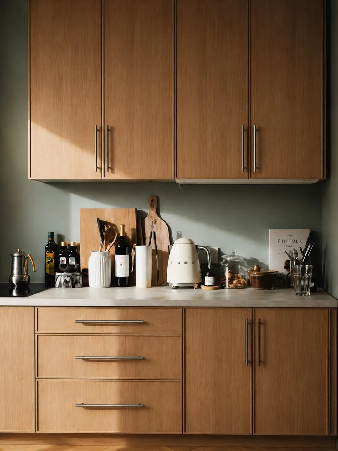
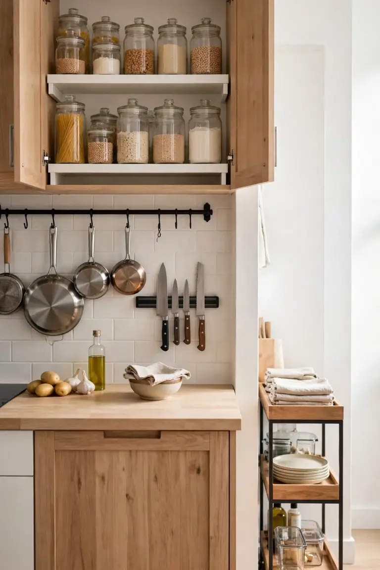
Wood cabinets left natural bring warmth and texture that paint cannot copy. Grain gives the eye something gentle to rest on, and wood tones flatter food, skin, and nearly every metal finish used for handles and taps.
Seal natural wood with a clear matte finish that protects against steam and grease without adding shine. Lighter woods like oak and ash keep small kitchens bright, while walnut and other deep tones suit larger rooms with strong daylight.
Homes with plain white walls and simple counters suit wood cabinets best, because the grain becomes the feature of the room. Families also value wood because small knocks blend into the grain instead of showing as chips in paint.
One baker stripped painted cabinets back to the oak beneath and sealed them with matte oil. Work took one long weekend, and the kitchen gained more warmth than any repaint had ever given it before.
Orange toned varnishes from past decades make wood look dated fast, and thick glossy lacquer does the same. Sand back to a clean surface, choose a pale or clear finish, and keep the look matte and calm for a modern result.
Black Cabinets for a Bold Statement
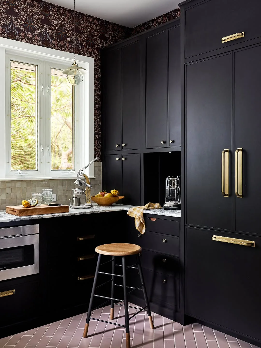
Black cabinets make a confident statement and turn simple cabinet shapes into strong design. Matte black also makes brass, copper, and pale wood glow beside it, so a few good handles can carry the whole scheme. Black also shrinks the visual weight of bulky cabinets, which can help a run of tall units feel calmer.
Good light matters more with black than with any other color on this list. Big windows, pale counters, and light floors keep black feeling rich rather than heavy, and under cabinet lamps stop work areas sinking into shadow. Glass fronted uppers or open shelves break up a black run and give the eye places to rest.
Large kitchens, kitchen diners, and rooms with tall ceilings suit black best, since the color needs breathing space. Confident cooks who like a restaurant mood at home often pick black for the lower cabinets only. Black also hides the scorch marks and grease shadows that gather near hobs in busy homes.
One host painted her lower cabinets matte black and kept white uppers and pale counters. Dinner guests kept drifting into the kitchen to talk, drawn by the warm, moody feel around the island each evening. She changed nothing else, which convinced two friends to try dark lowers in their own kitchens that winter.
Fingerprints and dust show on black faster than on any mid tone, and glossy black shows them worst of all. Matte or satin finishes forgive more, and a quick weekly wipe keeps the bold look sharp instead of shabby. A soft cloth kept in a drawer near the hob makes that wipe a ten second habit rather than a chore.
Two Tone Cabinets with Dark Lowers
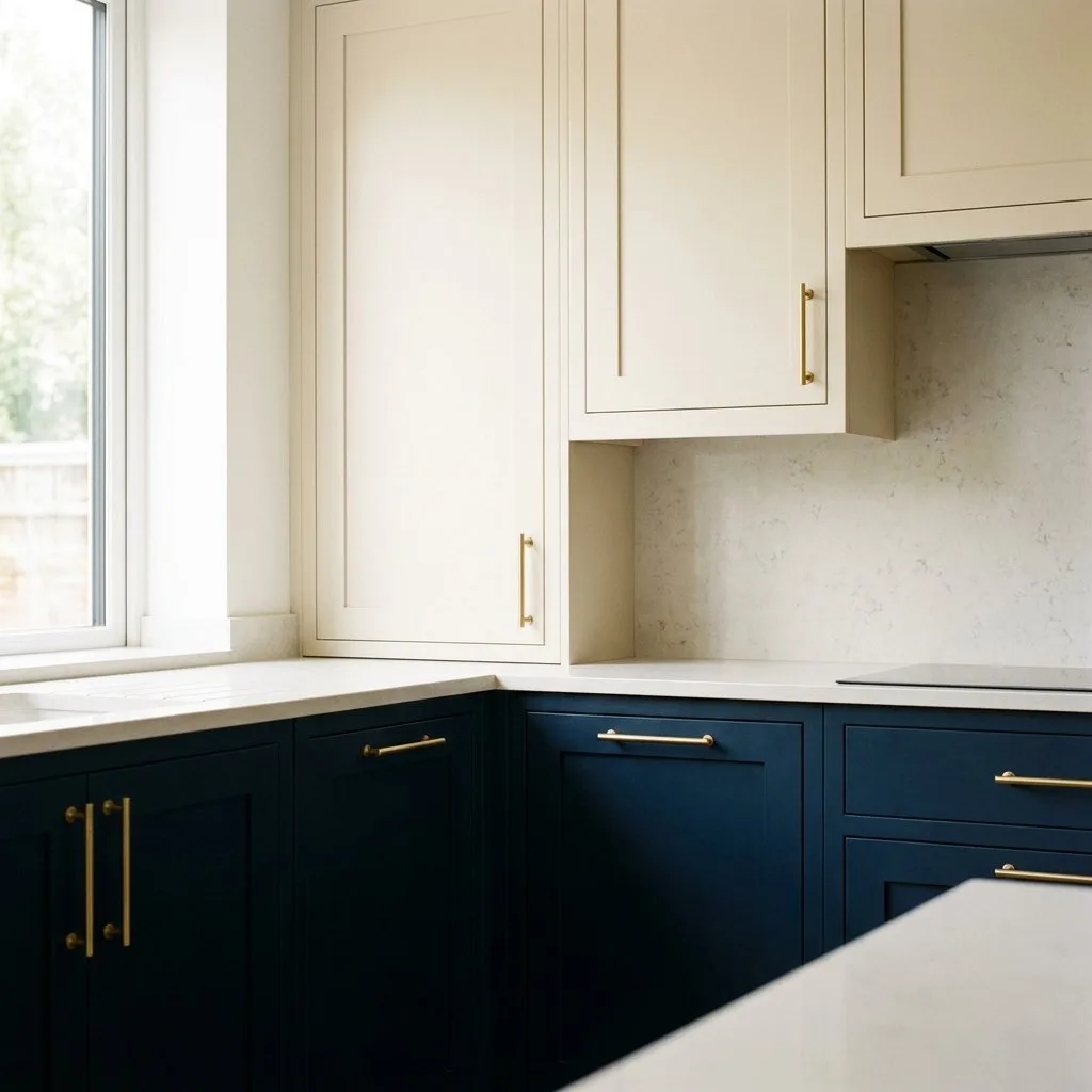
Splitting cabinets into dark lowers and pale uppers gives a kitchen depth without darkness at eye level. Heavy color sits low where scuffs happen, while light uppers keep the room bright and the ceiling feeling high.
Fans of kitchen cabinet color ideas that solve two problems at once often land on this pairing, because it hides marks below and keeps light above. Choose two colors from the same family, like sage below and warm white above, for the calmest result.
Families with small children and dogs suit two tone schemes well, since dark lowers shrug off kicks, paw marks, and toy crashes. Islands painted in the lower color tie the whole scheme together neatly.
One mother painted lower cabinets deep green after one winter of scuff marks on white doors. Uppers stayed cream, the room kept its brightness, and the weekly cleaning routine shrank to a fast wipe down.
Clashing undertones between the two colors ruin the effect quietly. Cool white above warm green looks like a mistake even when both colors please alone. Test both paints side by side in the room light before you buy full tins.
Pale Blue for a Fresh Coastal Feel
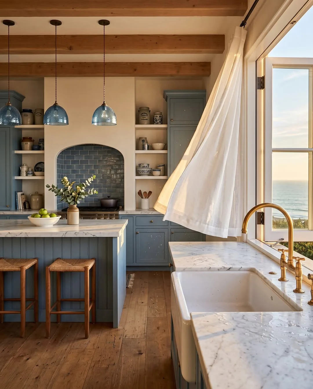
Pale blue brings a fresh seaside calm to kitchens and works especially well with white counters and light wood. Soft blue also cools down rooms that get hot afternoon sun, making summer cooking feel easier.
Keep the blue grey based and muted if you want the look to last, because sweet baby blues can feel childish across a whole wall of cabinets. White tiles, pale floors, and steel or chrome handles complete the coastal mood without themed decorations.
Sunny kitchens and homes near the coast suit pale blue naturally, though any bright room can borrow the feel. Households tired of grey often find pale blue a gentle next step that still counts as a calm neutral.
One couple painted their cabinets a misty blue grey and added simple white knobs. Morning light across the color made the whole room feel like a holiday cottage, even on ordinary workdays.
Strong bright blues fight with warm wood floors and yellow toned counters. Check the blue against every fixed surface at midday, and pick a softer mix if the room already holds lots of warm tones.
Greige That Bridges Warm and Cool
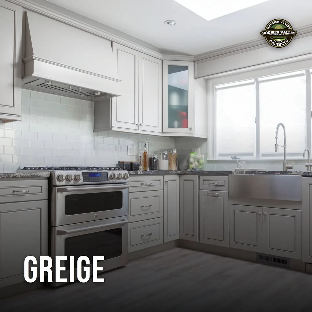
Greige sits between grey and beige, so it bridges warm floors and cool counters inside one calm color. Rooms with mixed finishes, which is most real kitchens, settle easily around greige because it argues with nothing. Greige also photographs softly, which is why it appears in so many calm kitchen pictures online.
Test greige carefully, because the same tin can read grey in one kitchen and beige in the next depending on light and nearby colors. Warm bulbs push greige toward beige, while daylight from big windows pulls it cooler. Bulbs matter here too, so test with the exact bulbs you cook under every evening.
Homes where the kitchen joins a living space suit greige well, because the color shakes hands with sofas, curtains, and rugs in both warm and cool tones. Sellers also like greige since buyers rarely object to it. Greige also pairs with both chrome and brass, so existing taps and handles rarely need changing.
One family could not agree between grey and cream until they tried greige on a spare door. Both sides claimed victory, and the color linked their oak floor to grey stone counters without any effort. The spare door test settled a month of debate in one afternoon.
Judging greige from a tiny swatch causes most regrets, because undertones only show across a large area. Paint one full door or a big board, live with it for two days, and watch morning and evening light. Greige rewards patience more than most colors on this list, because its charm is quiet rather than instant.
Forest Green for Rich Evening Light
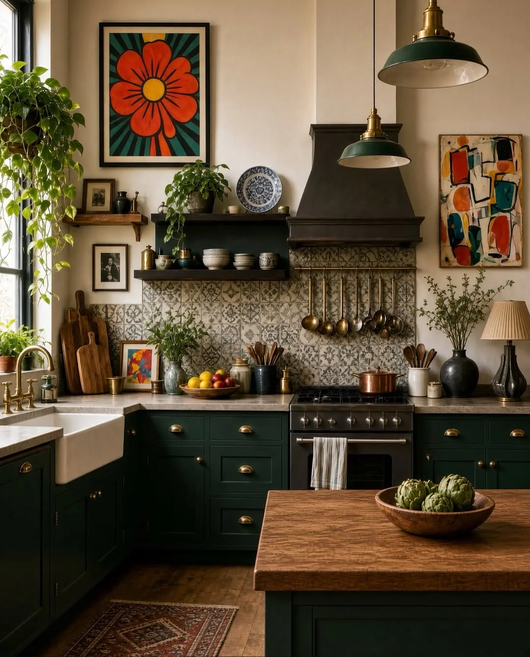
Forest green brings depth and a slightly formal richness to kitchen cabinets. Deep green glows under warm evening lamps, pairs beautifully with brass and wood, and makes white counters look crisp by contrast.
Reserve forest green for kitchens with decent window light, or use it on lowers and an island only. Pale walls and counters keep the depth feeling luxurious rather than heavy, and warm metals stop the green reading cold.
Evening cooks and households that eat in the kitchen suit forest green best, because the color performs at dinner time. Period homes also carry deep green well, since the shade suits traditional cabinet shapes and panelled doors.
One cook painted every cabinet forest green in a kitchen with a wide garden window. Daylight kept the room fresh, and at night the green and brass handles gave suppers a calm, club like warmth.
Mixing forest green with black counters and dark floors swallows all the light in the room. Leave at least two large pale surfaces in the scheme, and avoid blue based greens that can look harsh under warm bulbs.
Buttery Yellow in Small Doses
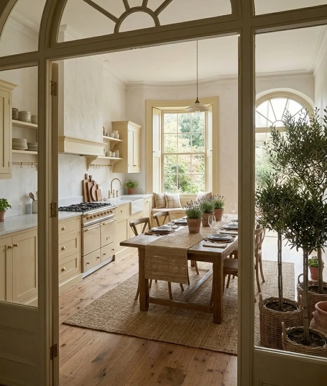
Buttery yellow brings sunshine into kitchens that face away from the sun. Soft, creamy yellow feels cheerful without the glare of bright citrus shades, and a little of it lifts white and wood schemes instantly.
Small doses work best: one island, the inside of glass fronted cabinets, or a single run of lower cabinets. Pair yellow with warm white uppers and pale wood so the color reads as an accent rather than a takeover.
Dim kitchens, basement kitchens, and rooms with tiny windows gain most from yellow. Cheerful cooks who start early also love it, because the color makes dark winter mornings feel friendlier the moment the lights come on.
One early riser painted only her island a soft butter yellow and kept the other cabinets warm white. Coffee at dawn felt brighter, and guests always asked about the happy color at the heart of the room.
Lemon bright yellows tire the eye fast across large areas and clash with many food colors. Stay soft and creamy, test under your evening bulbs, and remember that yellow intensifies once it covers a whole door.
Terracotta and Clay for Warmth
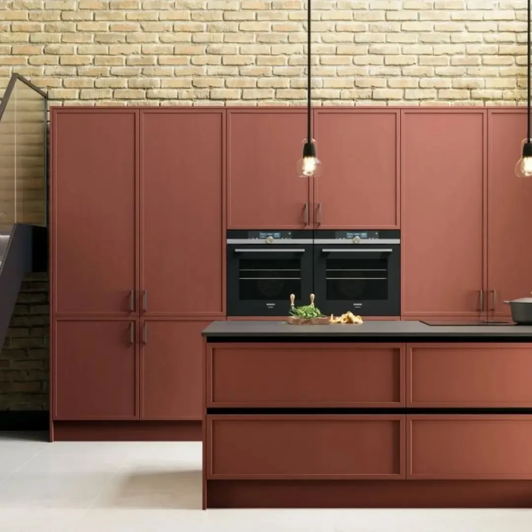
Terracotta and clay tones wrap a kitchen in earthy warmth drawn from tiles, pots, and sun baked walls. Muted versions feel natural rather than loud, and they pair well with cream, wood, and black metal details. Clay tones also flatter cast iron, copper pans, and wooden boards left out on the counter.
Earthy shades keep winning fans among kitchen cabinet color ideas because they feel warm in winter and settled in summer. Use terracotta on lowers or on one bank of cabinets first, since the color carries strong presence even in muted mixes. Cream walls and pale counters keep terracotta grounded, while brass handles warm the whole scheme further.
Homes with tiled floors, wooden beams, or Mediterranean touches suit clay colors naturally. Cooks who gather friends around the kitchen table also love terracotta because lamplight deepens it into a welcoming glow. Terracotta also suits kitchens that open onto gardens with brick or clay pots outside the door.
One host painted her lower cabinets a soft clay tone and laid a cream runner along the floor. Evening meals felt warmer at once, and the color hid the scuffs of daily family life with ease. She painted on a Friday and hosted dinner on the Sunday, with the color already feeling settled.
Red heavy mixes can slide toward orange under warm bulbs and fight with green foods and plants. Compare several clay swatches at night, choose the browner and quieter end of the range, and test beside your floor. Browner clays forgive more, blending with wood floors and tiled splashbacks without argument.
Dusty Pink in Small Kitchens
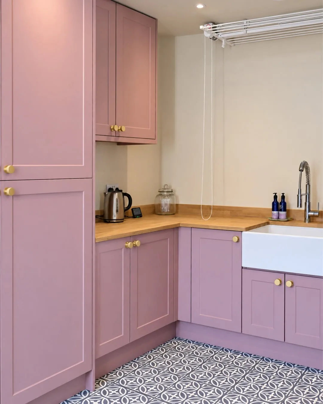
Dusty pink offers a soft, grown up alternative to grey and cream in small kitchens. Grey based pink reads as a warm neutral rather than a sweet pastel, and it flatters wood, brass, and white stone.
Keep the pink muted and pair it with simple shapes, plain handles, and calm counters so the room feels elegant instead of playful. Pale pink across every cabinet works in small rooms because the footprint stays modest.
Small kitchens in flats and cottages suit dusty pink well, since the color adds personality without visual weight. Households wanting warmth without dark colors often land here after ruling out both cream and grey.
One flat owner painted compact cabinets dusty pink with brass cup handles and a white counter. Friends described the tiny kitchen as the prettiest room in the home, and cooking space never felt smaller.
Candy and bubblegum pinks date quickly and overwhelm small rooms. The grey base is what keeps dusty pink calm, so reject any mix that looks sweet on the swatch and test beside your floor and counters.
Painted Island in a Contrasting Color
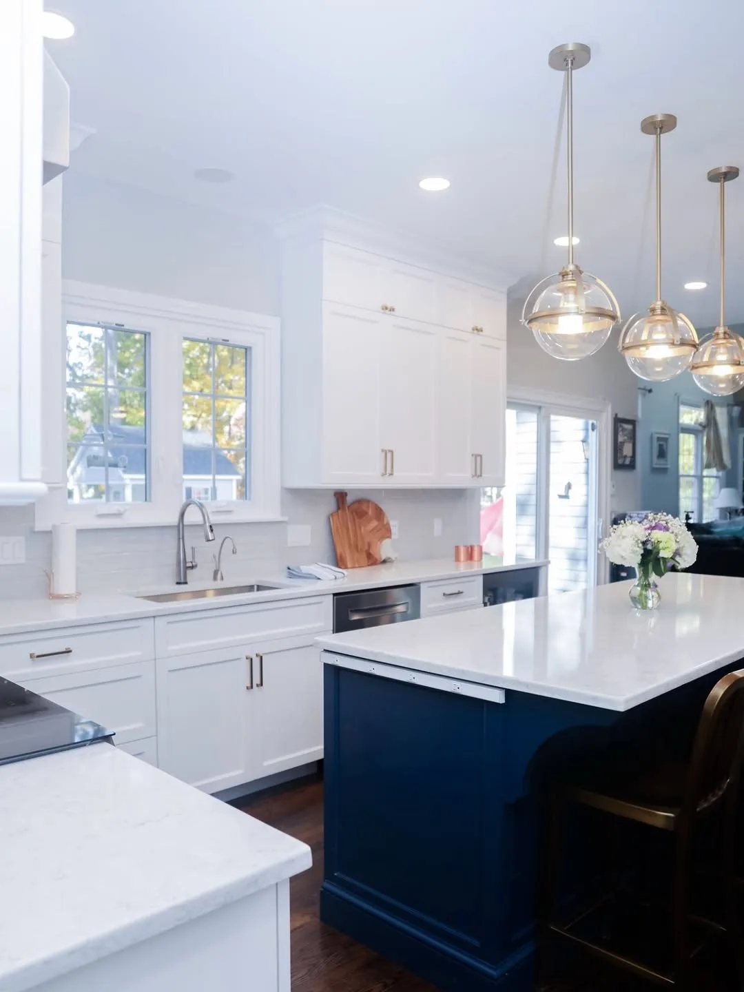
Painting only the island in a contrasting color gives a kitchen a clear focal point for the price of one small tin. Surrounding cabinets stay calm, and the island carries the personality, the risk, and the fun.
Pick the island color from something already in the room, like a tile tone, a floor fleck, or the metal of your handles. Deep navy, forest green, and warm black all anchor pale kitchens, while soft colors suit islands in already colorful rooms.
Cautious decorators suit this idea best, because one island is easy to repaint if taste changes next year. Islands also take the knocks of stools, shoes, and bags, so a deeper island color hides wear gracefully.
One family kept their white cabinets and painted the island deep teal blue. Wooden stools in natural tones finished the look, and the island became the spot where everyone gathered during parties.
Matching the island color to a random accessory across the room looks accidental instead of planned. Repeat the island color at least once more, in a cushion, a blind, or cookware on display, so the contrast feels deliberate.
Common Mistakes to Avoid
Rushing into a full repaint after seeing one photo causes most cabinet color regrets. Photos lie about light, and your kitchen has its own windows, bulbs, and fixed surfaces. Slow testing beats fast painting every single time.
Ignoring fixed elements leads to clashes that paint alone cannot fix. Floors, counters, tiles, and appliances stay put during a repaint, so the new color must suit what already lives in the room today.
Skipping preparation ruins even the best color choice. Grease, gloss, and loose old paint stop new coats bonding, and cabinets take daily knocks that expose weak spots fast. Clean, sand, prime, and use paint made for cabinets.
Following fashion too hard dates a kitchen within a few years. Colors you loved in a showroom can tire quickly at home. Choose shades you enjoy seeing daily, and let handles, stools, and cloths carry the passing trends.
Budget Friendly Kitchen Cabinet Color Ideas
Repainting cabinets costs a fraction of replacing them, and paint sits at the heart of budget friendly kitchen cabinet color ideas for good reason. One tin often covers a small kitchen, and doors can be painted in place with care.
Buying one good brush and quality cabinet paint saves money across the whole job, because cheap tools shed bristles and weak paint needs extra coats. Borrow ladders, trays, and sanders from neighbors instead of buying tools you will use once.
Keeping your existing handles and hinges trims the bill further, though a soak in warm soapy water and a polish can make old hardware look fresh. New handles in one simple finish still cost less than most people expect when bought in packs.
Testing with small sample pots protects the budget better than any discount. Samples cost little, cover a full door, and stop the classic waste of a full tin in the wrong color. Paint samples on spare boards if doors feel too precious.
Tips for Choosing a Cabinet Color
Start with the light your kitchen actually gets across a full day. North facing rooms cool every color down, while south facing rooms warm colors up. Judge swatches at breakfast, midday, and under evening lamps before you decide.
Look at floors, counters, and appliances as fixed facts, then hunt for kitchen cabinet color ideas that bridge their tones. One shared undertone between the new paint and the floor usually makes the whole room feel settled.
Paint one full door or a large board rather than trusting small swatches. Big samples show undertones honestly and let you move the color beside counters, windows, and appliances before money goes on full tins.
Match the color depth to the size of the room. Small dim kitchens usually open up with pale or mid tones, while large bright kitchens can carry deep shades on every door without feeling closed in.
Trust the colors you already wear and live with happily. Clothing, sofas, and favorite rooms reveal your real taste better than trends do. Cabinets surround you daily, so pick a shade that feels like you.
FAQ
How Long Does Cabinet Paint Last?
Good cabinet paint over proper primer lasts five to eight years in a busy kitchen before touch ups start to show. Satin and semi gloss finishes made for woodwork clean best and resist steam around kettles and dishwashers.
Can I Paint Cabinets Without Sanding?
Light sanding gives paint something to grip, and deglossing liquids help where sanding feels hard. Bare shortcuts usually peel at edges and handles within a year, so spend the hour on preparation and save the second repaint.
What Color Makes a Small Kitchen Look Bigger?
Pale colors with warm undertones open small kitchens best, especially warm white, cream, and soft sage. Matching walls closely to cabinets stretches the effect, while good lighting and clear counters finish the job.
Should Uppers and Lowers Match?
Matching uppers and lowers gives the calmest, most traditional look, while two tones add depth and hide wear below. Both approaches work, so choose by how much light the room gets and how brave you feel.
How Do I Test a Color Before Committing?
Brush the sample onto one door or a large board and live with it for two full days. Check it in morning light, at midday, and under evening bulbs, and hold it beside the floor and counters.
What Finish Suits Kitchen Cabinets Best?
Satin and eggshell finishes suit most kitchens because they wipe clean, hide small flaws, and avoid harsh shine. Gloss shows every mark, while flat paint stains and cleans poorly around stoves and sinks.
Conclusion
Color changes a kitchen more than any other single update, and paint keeps that change within reach of most budgets. Fifteen ideas in this guide cover pale, deep, warm, and cool directions, so one of them will suit your light, your floors, and your taste.
Pick two or three favorites, test them large, and watch them across a full day before you buy full tins. Honest kitchen cabinet color ideas survive real light and real life, and testing shows which shade does both in your home.
Prepare well once the choice feels right: clean, sand, prime, and paint with patience. Cabinets reward careful work with a finish that survives daily cooking, cleaning, and the small knocks of family life.
Enjoy the moment the last door goes back on its hinges. Fresh color will greet you at every breakfast, calm every busy dinner, and make the most used room in your home feel like yours again.